The Six Second Billboard Rule
Six seconds.
If billboard advertisers are fortunate, they have a vehicle passenger’s attention for about six seconds. They have the driver’s attention for even less time, if they have it at all. This is definitely not the medium you should be using to launch your next novel.
Many times, business owners think of outdoor advertising as they do any other form of advertising, but this is a potentially costly mistake. A billboard is not a brochure. It’s not a newspaper ad. It’s not even a business card. In reality, it’s more like a flash card, and adding needless extra words or images essentially ensures that potential customers will see none of them.
It’s an all-too-common misconception that if you add more information to your billboard, your prospective customer automatically acquires it. In actuality, most commuters won’t take their eyes off the road long enough to catch more than a few words. It’s critical to make those words count.
As a graphic designer, I consciously look at billboards. Unlike the typical oblivious motorist, I’ll even go out of my way to attempt to read those wordy, 20-foot-high novellas while idling at a red light or stuck in traffic on my morning commute. Even then, those cluttered, ill-designed boards bore me enough to turn my attention to the much more effective bumper sticker on the car in front of me.
Excessive text isn’t the only thing that can ruin a billboard campaign. The wrong choice of colors, amateur photos, poor layout and bland graphics can do equal damage, setting your message adrift in an endless sea of roadside hype.
During the design stage, remember that less is not only more, it’s essential. The most effective messages are almost always the simplest ones, consisting of one major idea or concept.
Billboard design is a balancing act. Think of it as a game where the object is to convey your message using the fewest words and images possible, while still keeping it pleasing to the eye and attention-grabbing. Find just the right combination of words and colors using a thesaurus and professional color charts. View your design from across the room. Can you read it? Is the message clear? Keep the “six second rule” in mind. If you play the game well, your cash register will ring. If not, you could be tossing your money into the quickly passing highway airstream.
Here are some design tips that will put you on a path to outdoor advertising success:
Text
Keep the text concise and limited to no more than 7 words, or one short phrase that is easy to read and understand. Clean, bold fonts work best. Avoid thin, decorative, ornate and script fonts. Make sure there’s adequate spacing between lines and letters to improve visibility. Avoid cramming text against graphics or borders. Use text colors that contrast with the background.
Graphics and Images
Use one major image or graphic concept. A single, large image is more visible and more impactful than a series of small, disparate images. Make sure your background is simple and does not interfere or clash with your text and graphics.
Colors
Use bold, high-contrasting colors that pop. Avoid using soft pastels and similar hues. Also, avoid using earth tones if possible, as these colors tend to blend in with the background scenery.
The Message
Use descriptive wording and don’t overcomplicate your pitch. Make it a single message that can be communicated effectively within seconds.
![]() The Good
The Good
Below are examples of billboards that use good design, bold visuals and limited, descriptive text to convey clear messages.
![]() The Bad
The Bad
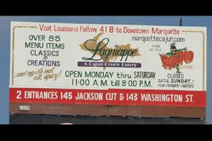
Look at the billboards below for six seconds each, then look away. What’s the main message of the board? How much information would you be able to recall about the business? How much of the information is actually necessary? What are the design flaws in each?
Design flaws in the above billboards.
1. Cluttered. Poor choice of colors. Extremely wordy. Unreadable, small text. Unclear message.
2. Cluttered. Extremely wordy. Unclear message.
3. Small text. Extremely wordy. Unclear message.
4. Poor choice of colors. Unattractive photos. Small text.
5. Unattractive photo. Small text. Unattractive design.


